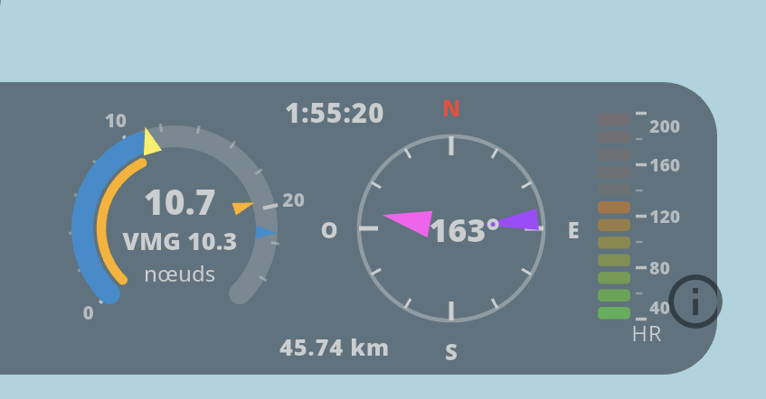
I had a great kite session yesterday. I want to share it with my buddies, and then I come across tons of new features, nice dials showing all kinds of info and so on (sorry, I couldn’t find the right smiley = a kid who got lots of new toys for Christmas)
I even found (purely by accident) the replay. I was able to share the video with my friends
At the top center, that’s the time from the beginning
Middle right, the compass, I see my heading. I imagine the other indicator is the wind (or maybe the swell, or maybe the sum of both)
At the bottom center, that’s the distance traveled up to the point
But I’m finding it hard to read the speed dial and the “vu meter” all the way to the right???
Great to hear you had a good session! Here’s a quick guide to the dashboard:
Top center: elapsed time
Compass (right): your heading, plus wind direction
Center of the compass: the angle between your course and the wind
Bottom center: distance covered so far
Left, big circle: speed — the blue marker shows your top speed for the session, the yellow marker shows wind speed at that moment, orange marker the VMG speed for the session
Small orange circle: VMG (velocity made good) — useful for upwind/downwind runs
Numbers in the middle: speed, with VMG speed just below it
Far right: heart rate — only moves if you recorded your pulse during the session
One note: since v2.1.0, the colors follow the standard WST theme — they’ll look different if you’re using another theme.
 (sorry, I couldn’t find the right smiley = a kid who got lots of new toys for Christmas)